Project
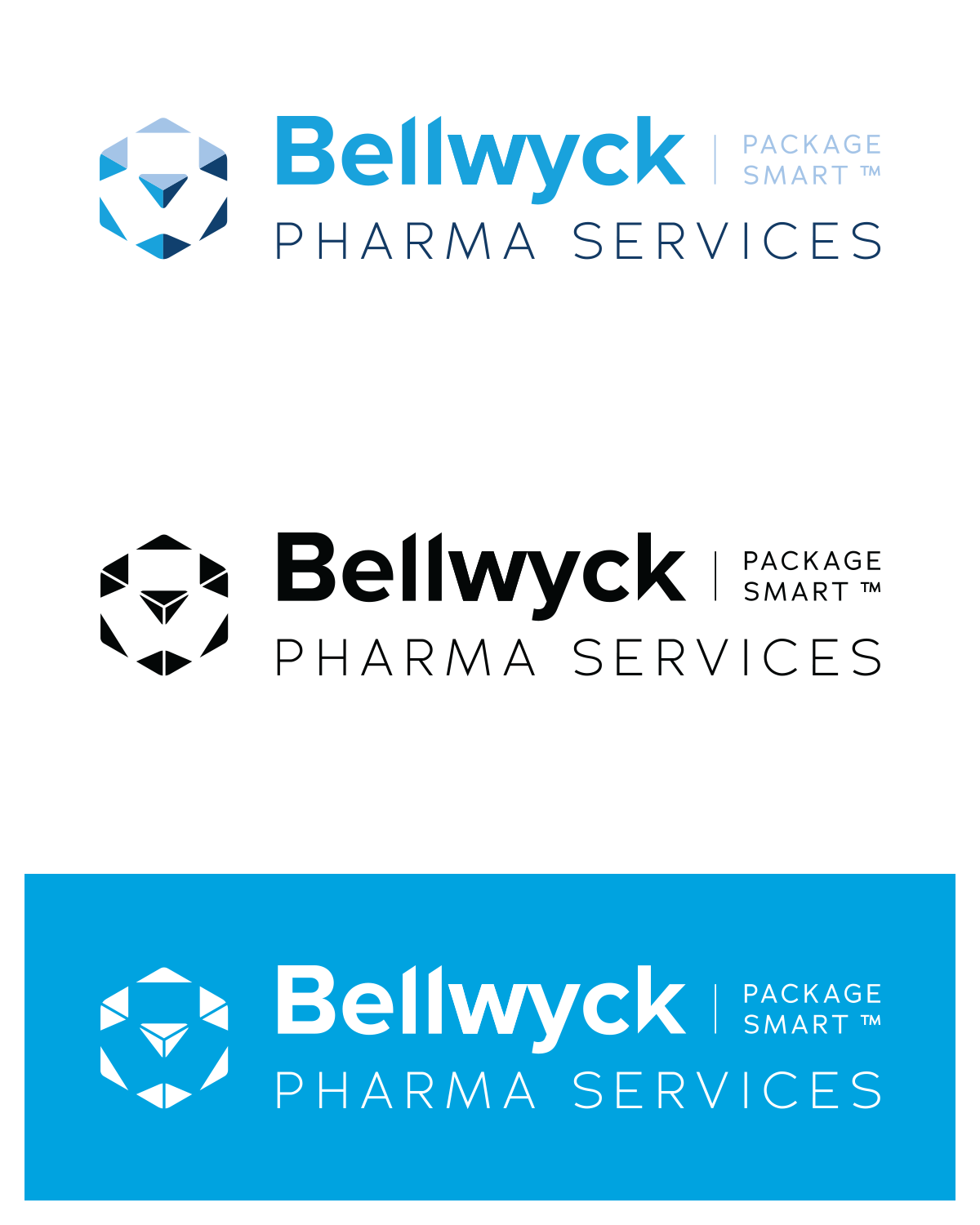
The client was solely focused on upgrading their logo with the main requirement of keeping the colours within a blue hue that is such a characteristic of theirs. However, during the development of the project, a new typographic scheme was also suggested as their website was modelled to reflect to their new visual style.
Primary descriptors: Experienced, sharp and innovative.
Secondary descriptors: Open, helpful, determined.
Secondary descriptors: Open, helpful, determined.
Agency: 2Social Inc.
Category: Brand Identity Design, Typography, Web Design, UX/UI.
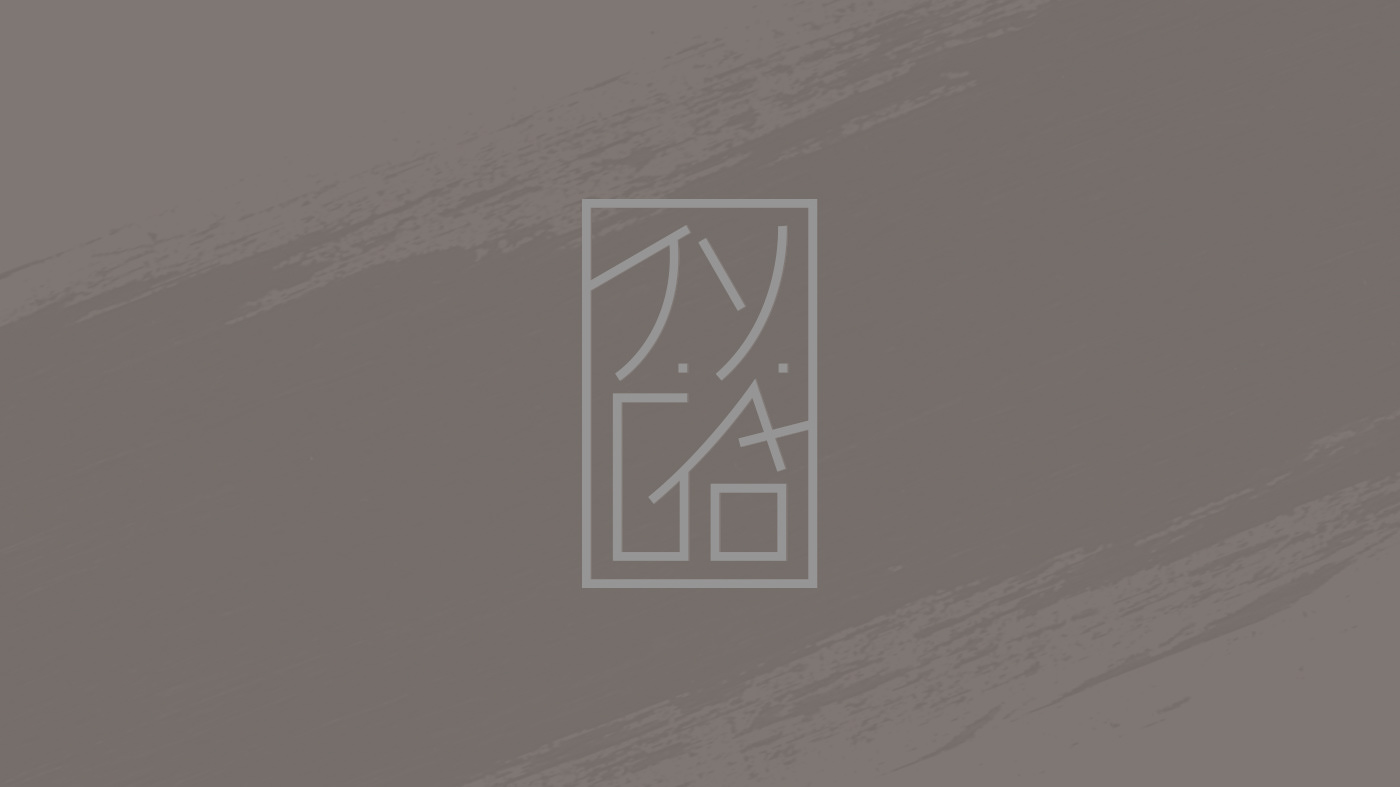
Logos

Bellwyck Pharma Logotype
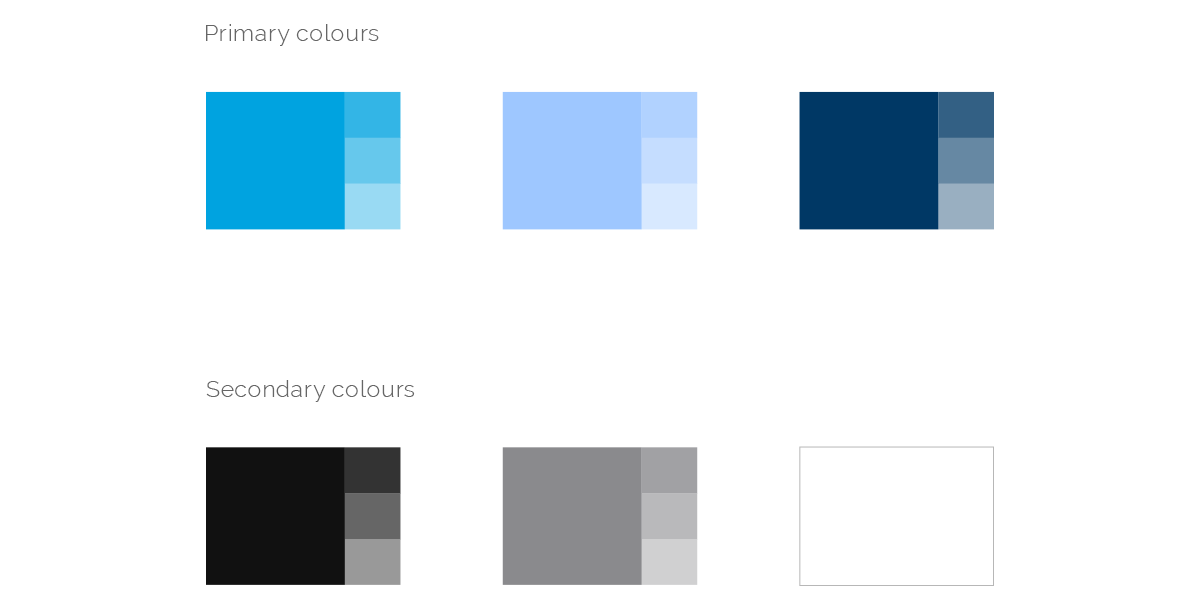
Colour Palette
Both colour palettes are built with a tint scale for each colour, in a decreasing percentage of 80%, 60% and 40%. The secondary palette becomes a neutral scale of grey tones It grants visual flexibility with a a more formal and experienced feel. The combination of both creates a good foundation that is able to speak comfortably to both of the core markets area that Bellwyck works with: premium products and pharmaceutical companies.
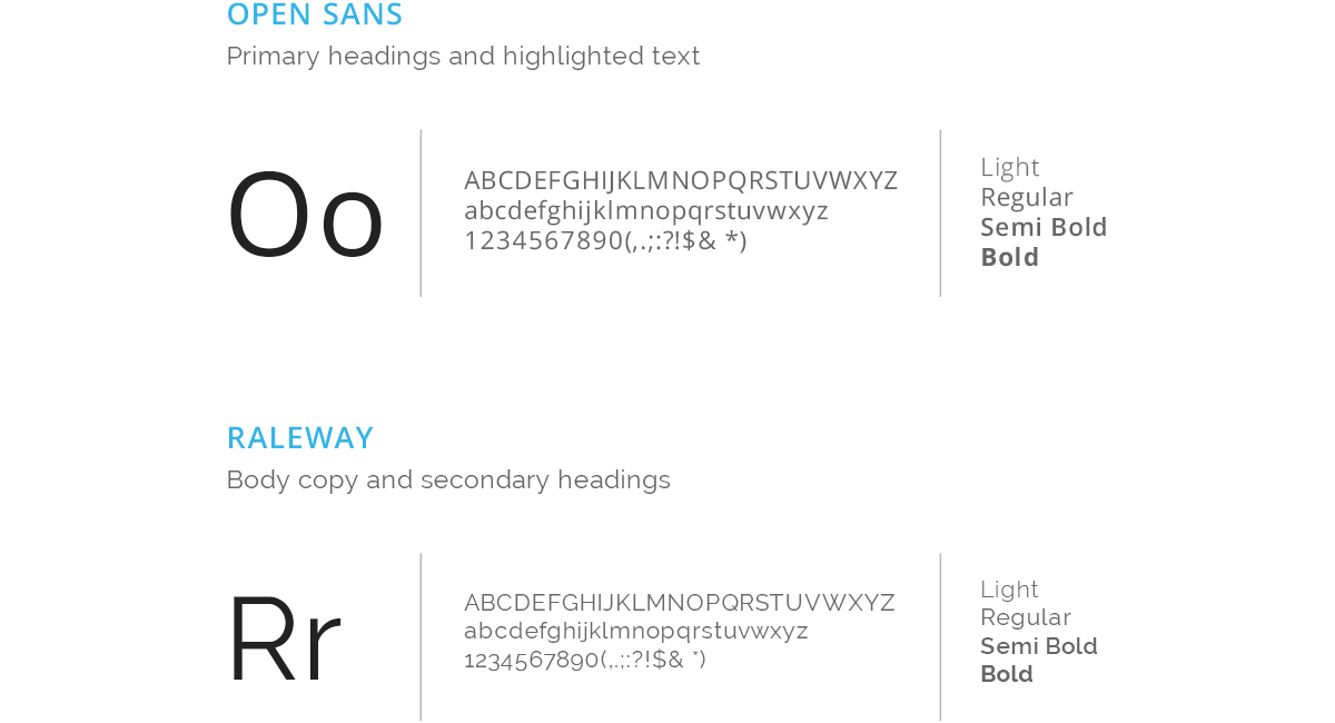
Typography
Bellwyck voice is clear, straight forward and confident. To portray these characteristics, the typhographic choices are clean, open and legible; with the right humanist details, yet distinguished and sharp.